


Online reviews: the unexpected effects of text and photos
Published on 07/5/2023
Thematics :

Published on 07/5/2023
No, the impact an online review makes isn’t just about how it’s rated or the comments it generates! The sequence of the text and photos also has an influence on the perception of internet users and the subsequent purchase decision – so says an article published by three co-authors, including NEOMA’s Jing Li. When 162 study participants were shown an identical review about the same Japanese restaurant, they reacted in very different ways depending on the layout of the editorial and visual information.
The influence leveraged by online reviews is now well established: consumers often feel they are more trustworthy than advertising. This upswing has generated a great deal of research into the impact of customer ratings on sales, the role of photo quality on purchase decisions, the semantic analysis of texts, and so forth.
Until recently nobody had considered the way text and photos are presented. Review writers are often given a free hand: they may start with text or photos, switch between paragraphs and visuals (or organise them in two blocks), be concise or too chatty, or suggest one or more photos. These observations prompted the authors of the article to test a novel hypothesis: the same review with identical content will elicit different reactions depending on its layout.
The researchers selected a lengthy review about a Japanese restaurant (40 lines divided into three paragraphs with 10 photos), which they split into four different versions:
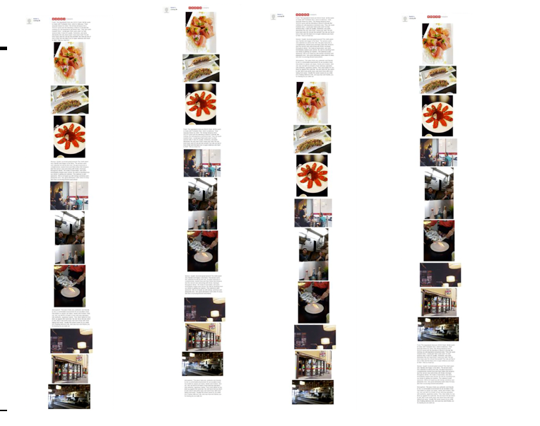
The authors then submitted one or other of the reviews on a random basis to 162 US internet users on the Amazon Mechanical Truk crowdsourcing marketplace. After reading the evaluation, participants were asked their opinion about the restaurant. They also indicated whether the review had been helpful and whether it had aroused positive (enjoyment, satisfaction, etc.) or negative feelings in them.
The results were clear-cut: the versions that began with text (1 and 3) generated more favourable opinions about the restaurant and the usefulness of the review itself than those beginning with a photo (2 and 4).
And there was another lesson to be learned: the versions organised into two blocks (3 and 4) drew more favourable opinions about the usefulness of the review than those with alternate text and photos (1 and 2). Conversely, the latter invited more positive feelings than the two-block versions regardless of whether the text or photos came first.
What do these outcomes tell us? First, that choices about presentation, which are often left to the discretion of the review writers, have an influence on the way internet users react, and ultimately on their purchase decisions.
The authors of the article believe that a product or service review will be more positive if it begins with text. Conversely, putting photos first runs the risk of confusing and distracting the reader, inducing a state of mind that is less inclined to make a purchase.
Furthermore, firms whose business depends heavily on online reviews – rating platforms in particular – would be well advised to take control of the layout options so they can dictate the best-selling way of presenting reviews.
In addition, the authors suggest that e-commerce sites should build on the findings of the study when presenting their product pages. Leisure items (video games, for instance) would benefit from descriptions based on alternating text and photos in order to create a feeling of pleasure. For more utilitarian products (tools, household equipment, etc.), it is better to organise text and photos in two separate blocks: this layout appeals more to the intellect and makes the offer easier to understand.
Above and beyond these tips based on the study’s findings, the research is also of interest because it highlights the cognitive mechanisms behind the different effects of the layouts. Numerous studies have established the superiority of multi-channel communication over its single-channel counterpart. Complementary texts and photos produce mental representations that the mind merges with ease, creating a more all-encompassing perception of reality than from a standalone photo or text.
But this theory is static: it considers texts and photos as clues to be processed, but does not factor in their presentation and the order that the eye discovers them in.
The article provides this dynamic aspect. Putting the text first informs and facilitates the cognitive mechanism of processing the “clues” that will follow, resulting in a better understanding. Contrariwise, alternating text and photos forces the reader to change communication channel sequentially, which uses up energy and is detrimental to understanding; this explains why reviews structured in this way are considered to be less helpful.
Photos attract more attention than text, are easier to understand in overall terms and elicit stronger feelings; nevertheless, they may have counter-productive effects. This is in all likelihood what Confucius meant 2,500 years ago when he wrote that “a picture is worth a thousand words” – but to be used wisely and sparingly.
Jing Li, Xin Xu and Eric WT Ngai Presentational Effects of Photos and Text in Electronic Word-of-Mouth on Consumer Decisions, Internet Research, April 2023. Do i: 10.1108/INTR-03-2021-0143